SingSaver Product Comparison Pages

Purpose of the project - Refresh microcopies across all product listings on the various comparison pages (credit cards, insurance, loans etc.), so as to boost user-friendliness in the application process.
Problem - Legacy content were inconsistent, unformatted and outdated. Text presentation, especially on mobile, was poor. It hindered a more thorough understanding of the various products before applying for them. The CS team was also flooded with tickets from applicants.
Challenge - A UX/UI redesign was not on the cards, rendering the written content the only element we could improve upon. Moreover, resources were scarce and the UX content refresh workload was required to be balanced with editorial demands within a deadline, as it implicated users in their applications. In other words, there would be business impact if users did not fully comprehend what they were signing up for, and how they could qualify for the rewards.
Challenge no. 2 - Finance is an intimidating topic for many. How do we then break such product content down into simple, understandable, layman terms such that even a 10 year-old would understand?
My role - I set up a calendar of events to break down the refresh exercise into smaller batches to be completed in phases (i.e. 12 product listings per week, across 3 months). Following which, I wrote a product content style guide that spelled out how each product's offers, specs and T&Cs should be presented. In the execution phase, I worked together with a writer to rewrite, standardise and republish all products' content.
Final product showcase - A much clearer presentation of product details that no longer misleads users. All refreshed products also displayed the most updated information (i.e. interest rates, cashback percentage etc.)
---
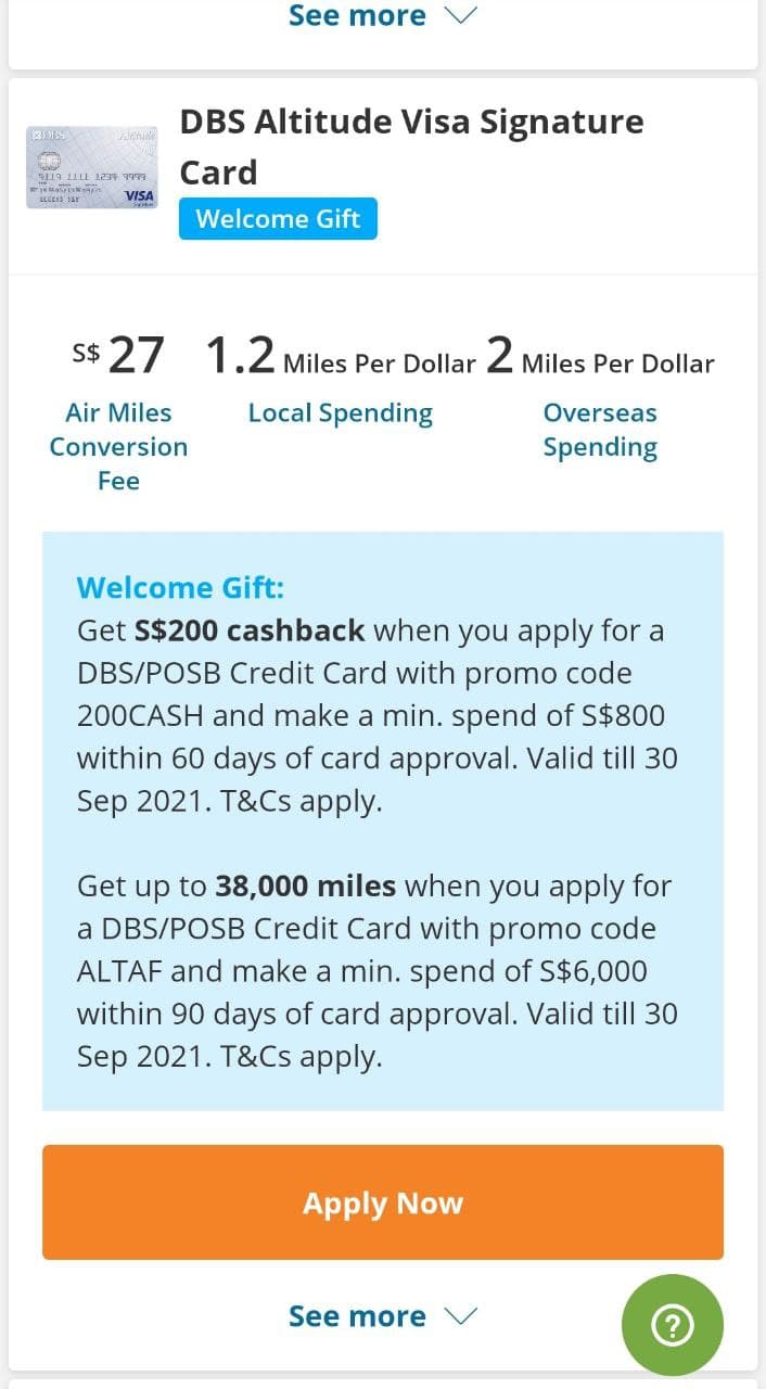
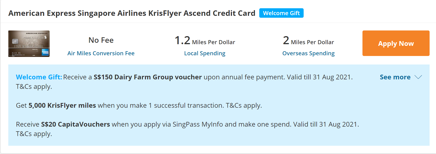
How a product listing looks like...
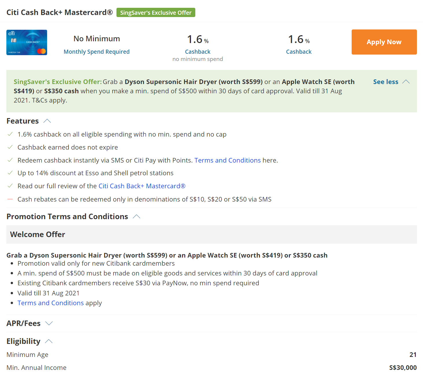
(Yes, there were close to 150 of these to refresh!)
Let's go deep into some of the problems and solutions
1. Mobile interface restrictions
A good percentage of users were signing up for a new credit card and claiming their rewards via mobile. While we were generous with these rewards, we had to be stingy with characters. Otherwise, the content elements would appear unnecessarily chunky and less readable.
In the product content style guide, I introduced guidelines such as character limits for different content elements (i.e. promo banner copies to be no more than 180 chars, 'Feature' copies to be no more than 1 line on desktop). Usage of abbreviations, replete with its own set of rules, was also part of the guidelines implemented.
2. Multiple offer complications
We regularly inform users of stacked rewards. There's much value in it for them, sure, but that's not so great for us. Why's that? It's on us, then, to write copies in a clear, concise and space-saving way that effectively communicates what they can or cannot receive, how they can qualify, as well as what's fulfilled by the company, and what's fulfilled by the partner bank.
In this case, it looks like a user could score all of the listed rewards inside the blue promo banner. While that may be true in this instance, there are differing hoops to jump through. For the sake of clarity, we decided on the use of paragraph breaks to demarcate each reward and its accompanying 'hoop', rather than to adhere to the character limit rule and lump them all together.
3. How to give users (almost) perfect information
It's easy to present a summary of the good stuff under the 'Features' section and have users signing up for a card. In adhering to our objective of empowering people to own their personal finance, how do we give them the gift of knowledge within the product listing, and help them decide if that particular product is truly right for them?
That's when we started introducing a mini-CTA to direct users to a full blog review of the product they were eyeing.
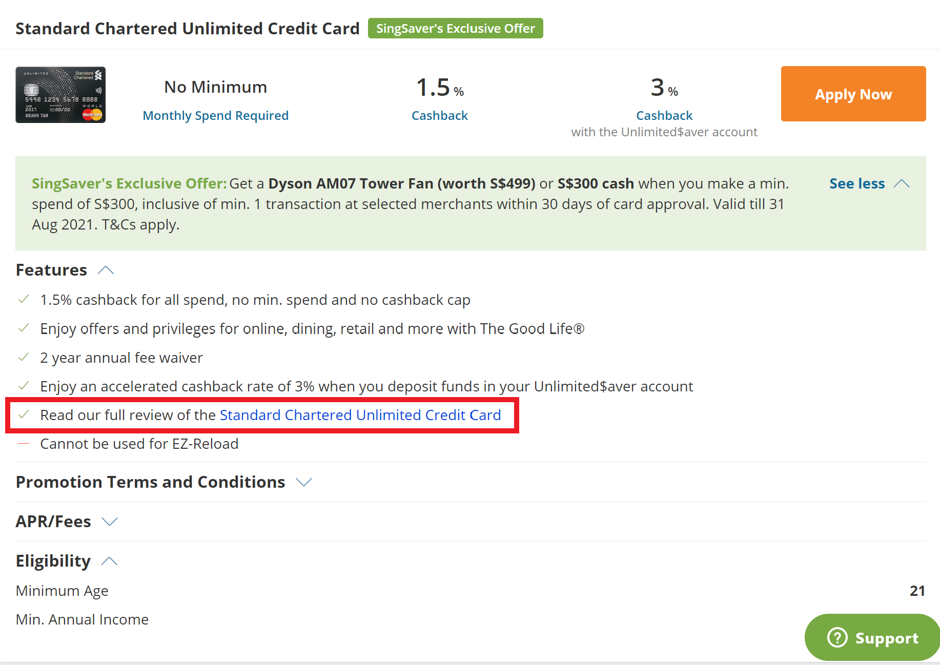
That way, we minimise a broken user journey where users open a new tab to check out the provider's website or Google a review of it.
Results
- Clearer, uncluttered presentation of copies that make for improved readability and decision-making.
- Contributed to lower no. of tickets from customers regarding confusing promo mechanics.
- Content refresh efforts assisted in garnering new listing enquiries from potential partners
Post a comment