OKX Lite - Crypto trading for one and all
Introduction - Throughout the development of the OKX Lite mode MVP, I supported 7 core feature squads in strategising and producing UI content for in-app flows, as the sole Content Designer. The content also include push notifications, emails, SMS and FAQs. The core features were: buying and selling, sending and receiving, market, portfolio, earn, trading and architecture.
Objective - With a simplistic interface and guided transaction journeys, OKX Lite seeks to democratise crypto trading and increase accessibility for the masses. An accompanying mission in the process is to reduce customer tickets, due to awkward English content on the more dominant Pro mode (they read as if they were machine translated in bulk from Chinese).
My role - I worked closely with Product Designers and Product Managers to digest product requirements, before executing the content on Figma based on the lo/mid/hi-fi design flows. For partial ownership projects, I functioned as the advisor and reviewed placeholder texts to ensure consistency with the voice and tone, as well as the glossary of terms. I also wore the hat of a 'Content Engineer' whenever I was called on for content keys bug bashing by the engineers.
Challenge - OKX's brand awareness and identity were lacking, compared to household names like FTX (fronted by Sam Bankman-Fried), Crypto.com (endorsed by Matt Damon) and Coinbase (the go-to spot trading platform). The OKX Lite mode MVP is a shot at the moon to gain new user base and retain them using an easy-to-use UI, clean language, and identifiable elements.
What each sprint looks like:
1. Start alongside everyone else at product kick-offs
2. Tag-team with Product Designers (async/face time) through lo-to-hi fi designs
3. Lo/Mid-fi - Content explorations
4. Hi-fi - Final content iteration, peer review with fellow Content Designers
5. Trigger localisation on Lokalise
6. Review returned translations
7. If need be, troubleshoot content bugs or keys with developers
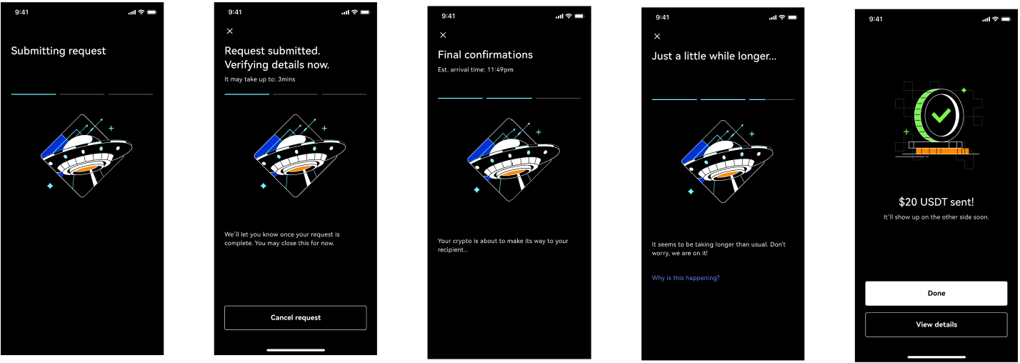
Showcase #1: Send crypto to a friend or your other crypto wallets
Highlight
Much discussion was had between the PM and PD on the end of the Send flow, where users see increased anxiety. Their crypto funds are on the way to the recipient, and they have to endure a wait.
The PM desired an explanation of the blockchain approval process that determines how much time the Send transaction will take. It's to take advantage of the real estate. The PD needed an idea on how to deal with delay cases in this status progression flow.
I lent my expert content design opinion that even though there's literally room to educate users on what's happening behind the scenes, having a large chunk of text breaking down the technicalities of blockchain confirmations would do little to value-add to the user experience at this point. It could be a good idea, as instructed under the 'Request submitted' status, to let the users know they can leave it running and do something else. There is an estimated time indicated, after all.
To assist the PD's conundrum, I suggested that we could do it like food delivery apps (leveraging on my GrabFood experience) and add a 4th status (Just a little while longer...) whenever a delay is triggered, replete with a FAQ at the bottom of the page. This status progression flow was supposed to be end at the 3rd 'Final confirmations' screen.
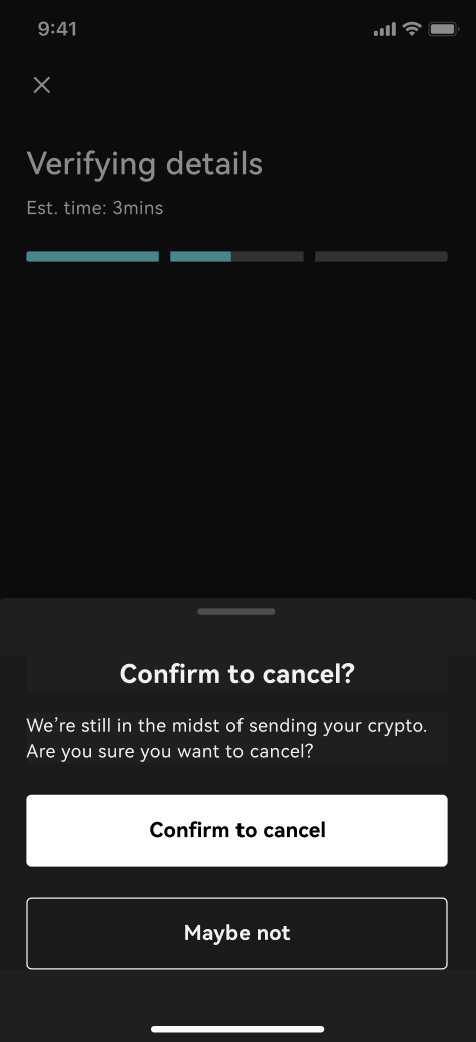
What happens when you tap on 'Cancel' halfway through:
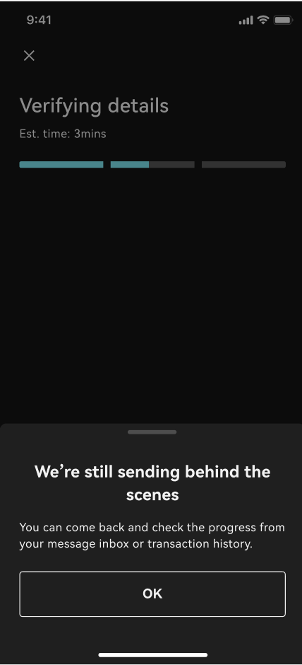
What happens when you tap on the 'X' button on the top left:
Link to OKX Lite Send Figma
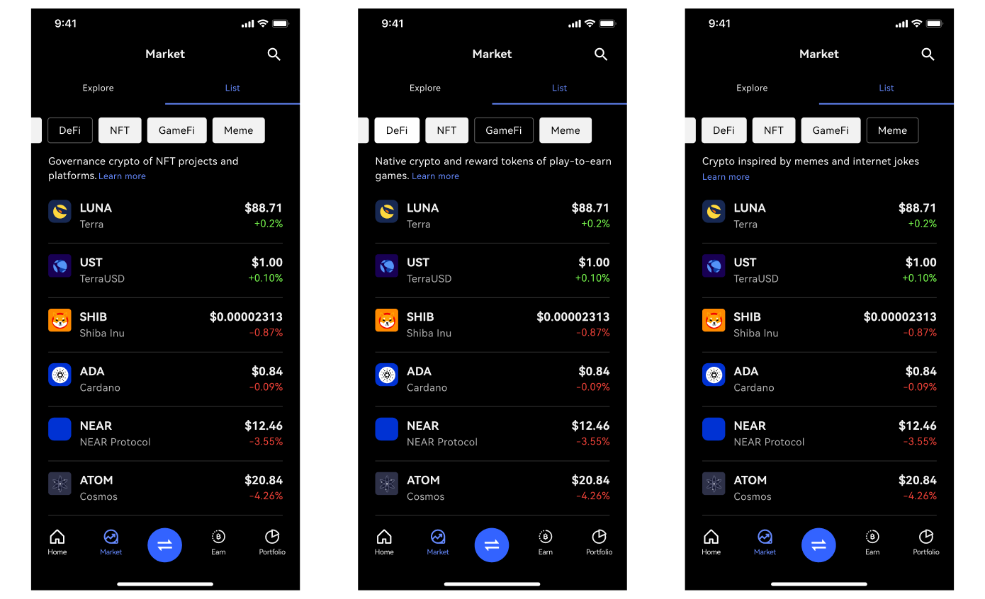
Showcase #2: An unconventional 'Market' page for users to explore crypto
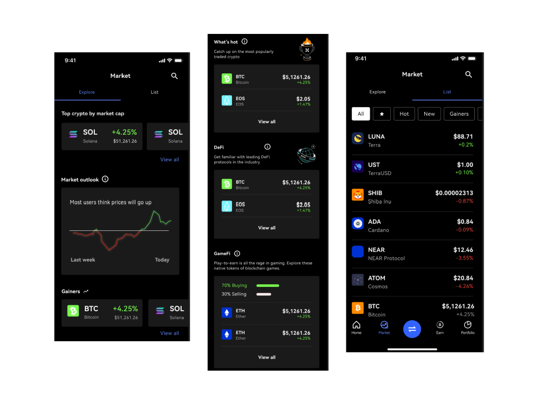
Highlight
The squad and myself kicked off the project with a 'Crazy 8s' exercise; under a timed interval, each member composed random sketches of what the 'Market' page would look like. It resulted in a switchable view that you wouldn't see on most other crypto exchanges: a resource-rich 'Explore' tab, and a traditional 'List' view tab.
The 'Explore' tab fulfills users' wants from a research study that conclusively pointed towards a thirst for knowledge. For example, by being exposed to information such as the position most other users are taking, or the most popularly traded coins in the last 24 hours, they can make a more informed decision before buying into a coin. The design is also visibly more vibrant compared to the 'List' view, to encourage greater readership.
To me, the 'List' view is still a must-have to play to users' existing mental model. They may be intimidated by the 'Explore' view's foreign environment if they are switching over to OKX Lite from other crypto exchanges, where they're used to browsing crypto and prices under a traditional view.
We introduced some level of interactivity under 'List' as well, with filters and a dynamic content string that explains the crypto category in a line.
Post a comment