GrabFood Self Pick-up
Objective - Minimise unhappy delivery experiences by giving users the option to pick up their own orders from nearby eateries. At the same time, they get to skirt delivery fees.
Purpose of the project - Create a win-win situation for all parties involved. Users save delivery fees that at times see hikes, whereas restaurants have one more means of keeping orders up. It also regulates the demand and supply of drivers during peak hours or bad weather days.
My role - I advised key stakeholders, from UX designers to product managers, on choice of words and terminologies based on the user flows and framework of each screen. I was also responsible for activating the localisation experts to translate content for the different markets.
Challenge - How to get traction going for this self pick-up feature, when the ingrained habit or behaviour is to enjoy the convenience of doorstep delivery. At the same time, another large-scale launch called Scheduled Delivery was also penciled in in the same sprint, which required delicate multi-tasking.
Final product showcase - A self pick-up option that is seamlessly integrated into the normal delivery flow.
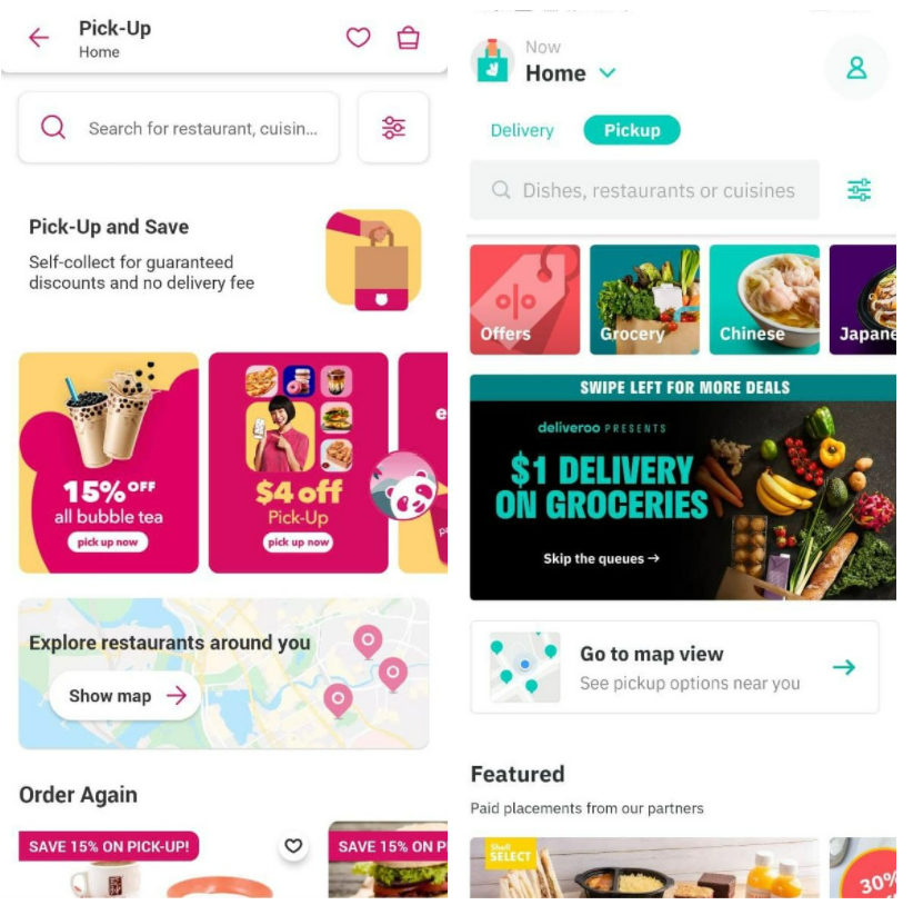
Competitor analysis & product naming
The naming of the product was the first of important discussions between myself, the UX designer and the product manager. The 'dummy name' was initially 'GrabFood Takeaway', but 'Takeaway' was not as widely used a term as the colloquial usage, 'dabao'.
Competing food delivery platform foodpanda went with 'Pick-Up', whereas Deliveroo used 'Pickup'. I took a cue from McDonald's kiosks, which use 'self-collection'. In the end, user testing pointed us towards the 'pickup' direction, and it was finally decided that it'll be called 'self pick-up'.
Deep-diving into content design for self pick-up
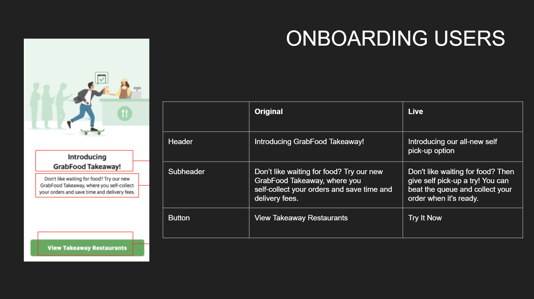
Some onboarding screens are great for generous real estate, such as this one. It was the first pop-up screen users would see upon their next login, and it presented a great opportunity to 'sell' solutions to two of users' biggest pain points here: expensive delivery fees (that's on top of the marked-up menu prices) and long queues. Users now have an alternative to just delivery and they could choose to pick up their own food, all without delivery fees. They can 'jump the queue' whenever their food is ready for collection. These are called out in the body text.
As for the CTA button, the original text 'View Takeaway Restaurants' came across a 'soft' CTA. I didn't want the users to just browse for fun, I want them to be acting on it and absorbing both the tangible and intangible benefits of saving both time and money. Hence, it was edited to 'Try It Now'.
Homepage tooltip onboarding
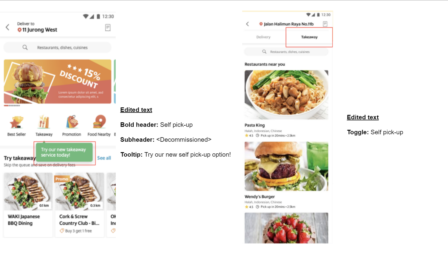
Browse self pick-up restaurants
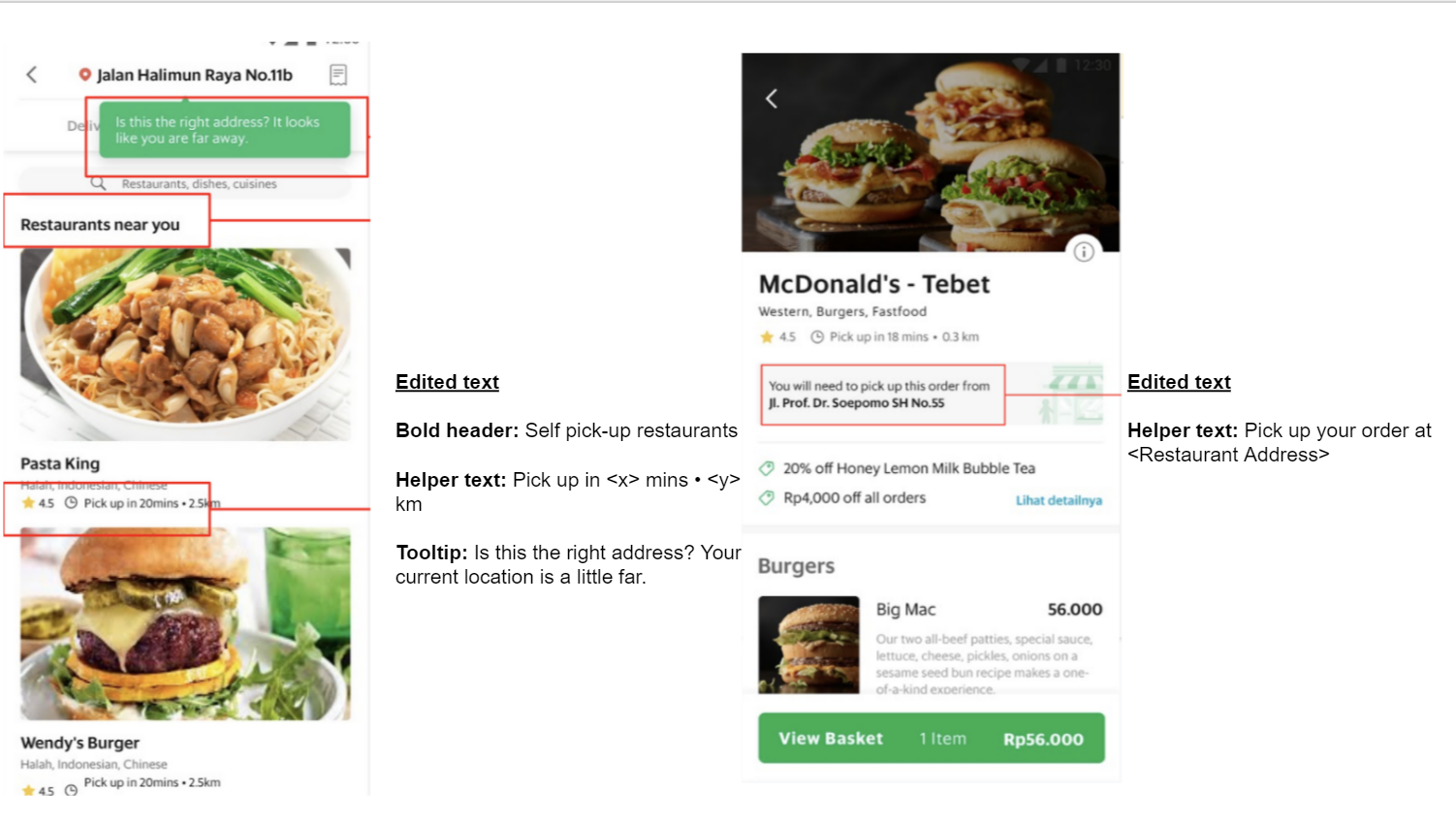
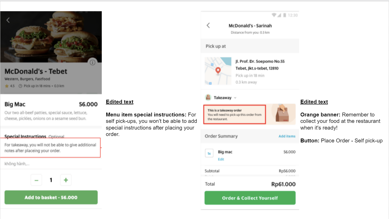
Menu item + Checkout
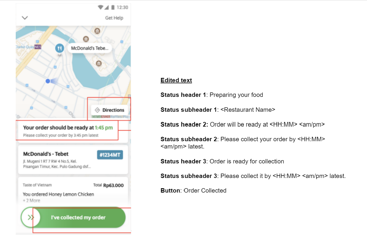
Self pick-up order statuses
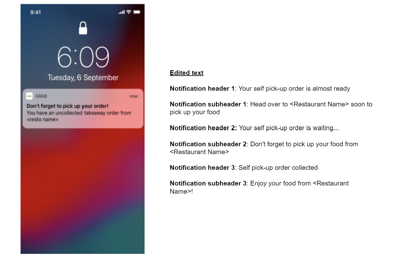
Self pick-up: Push notifications
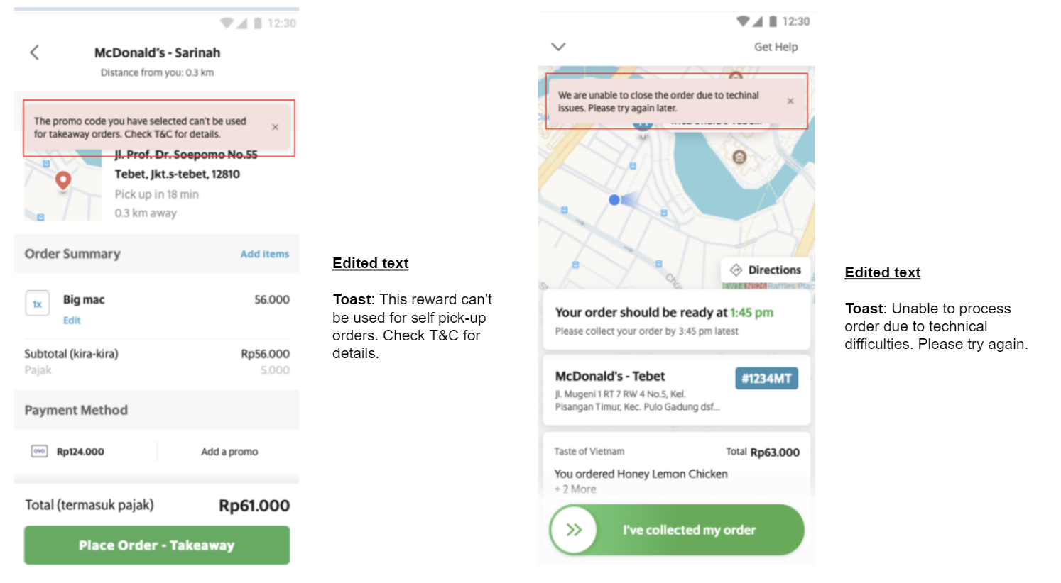
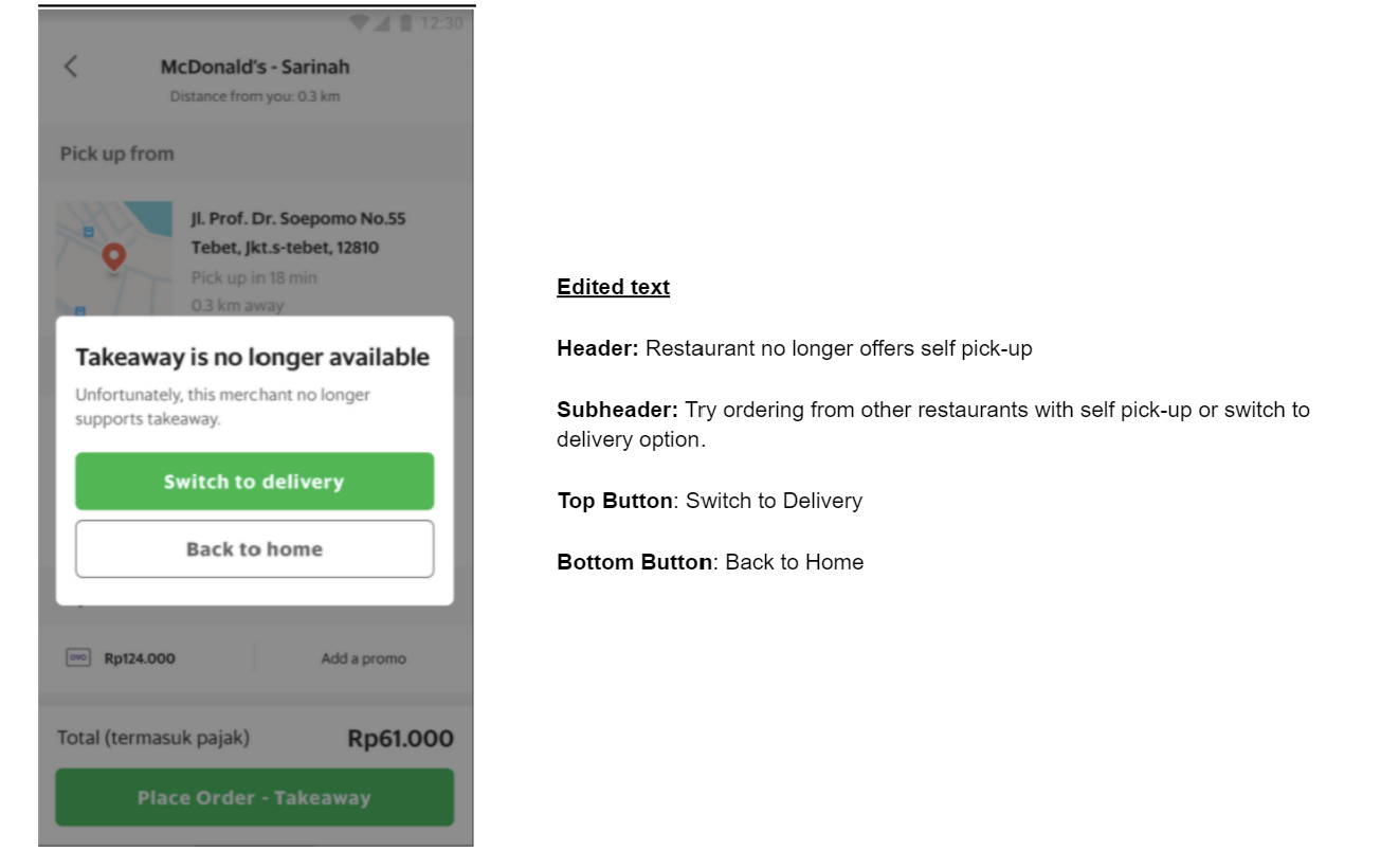
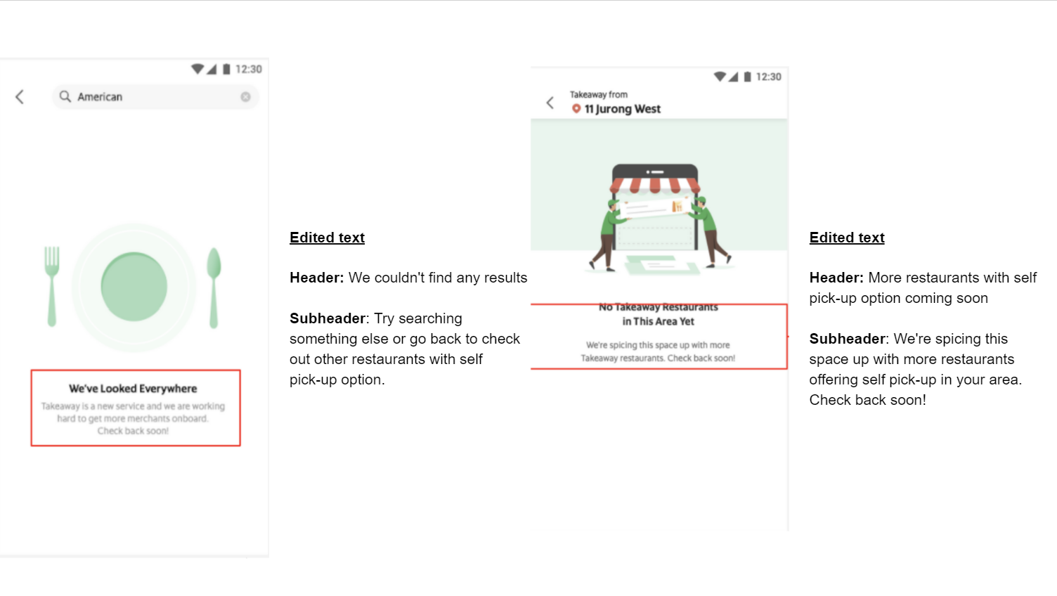
Errors & Edge cases
Post a comment